

Lttl
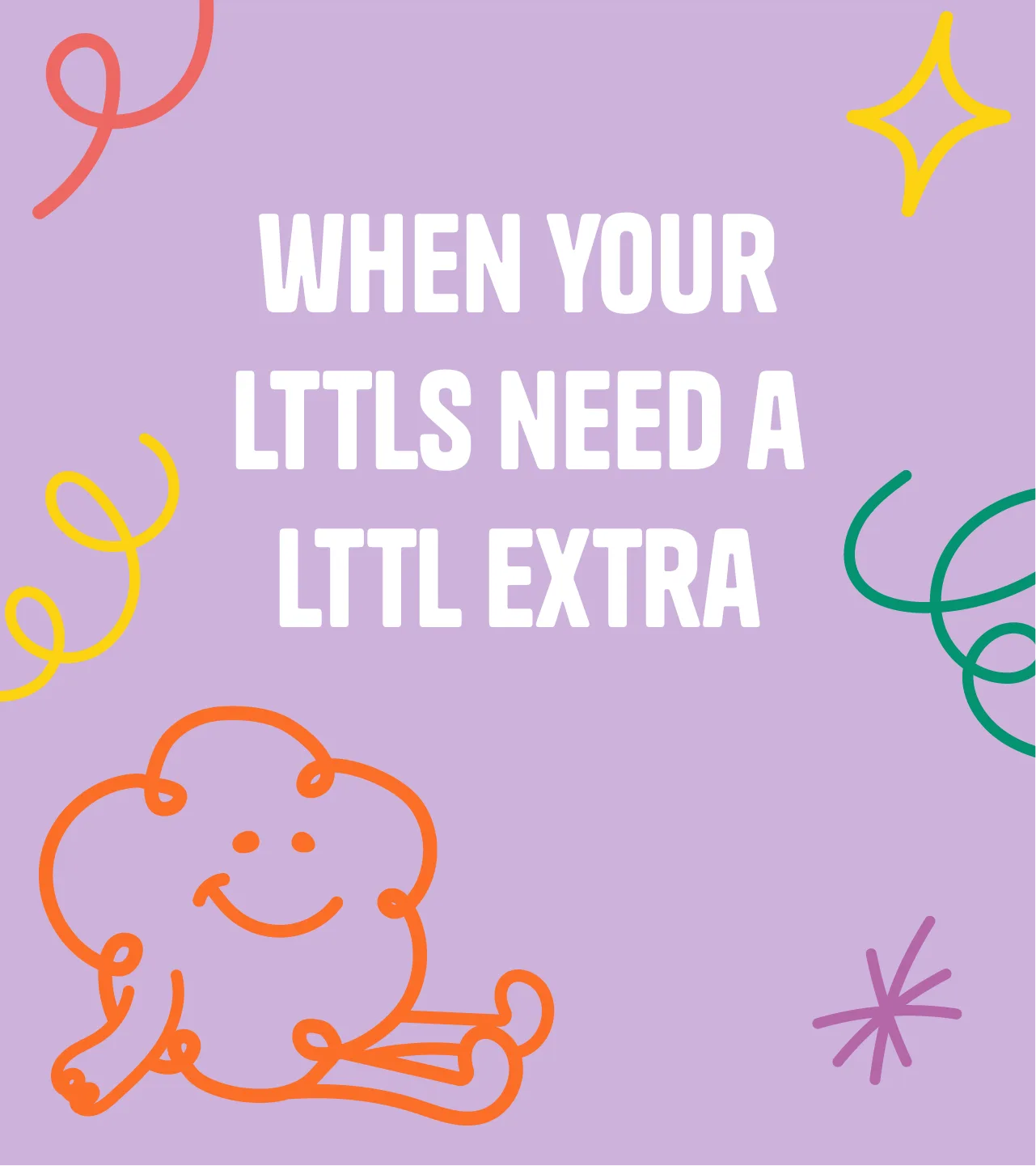
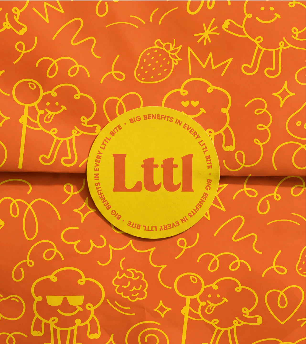
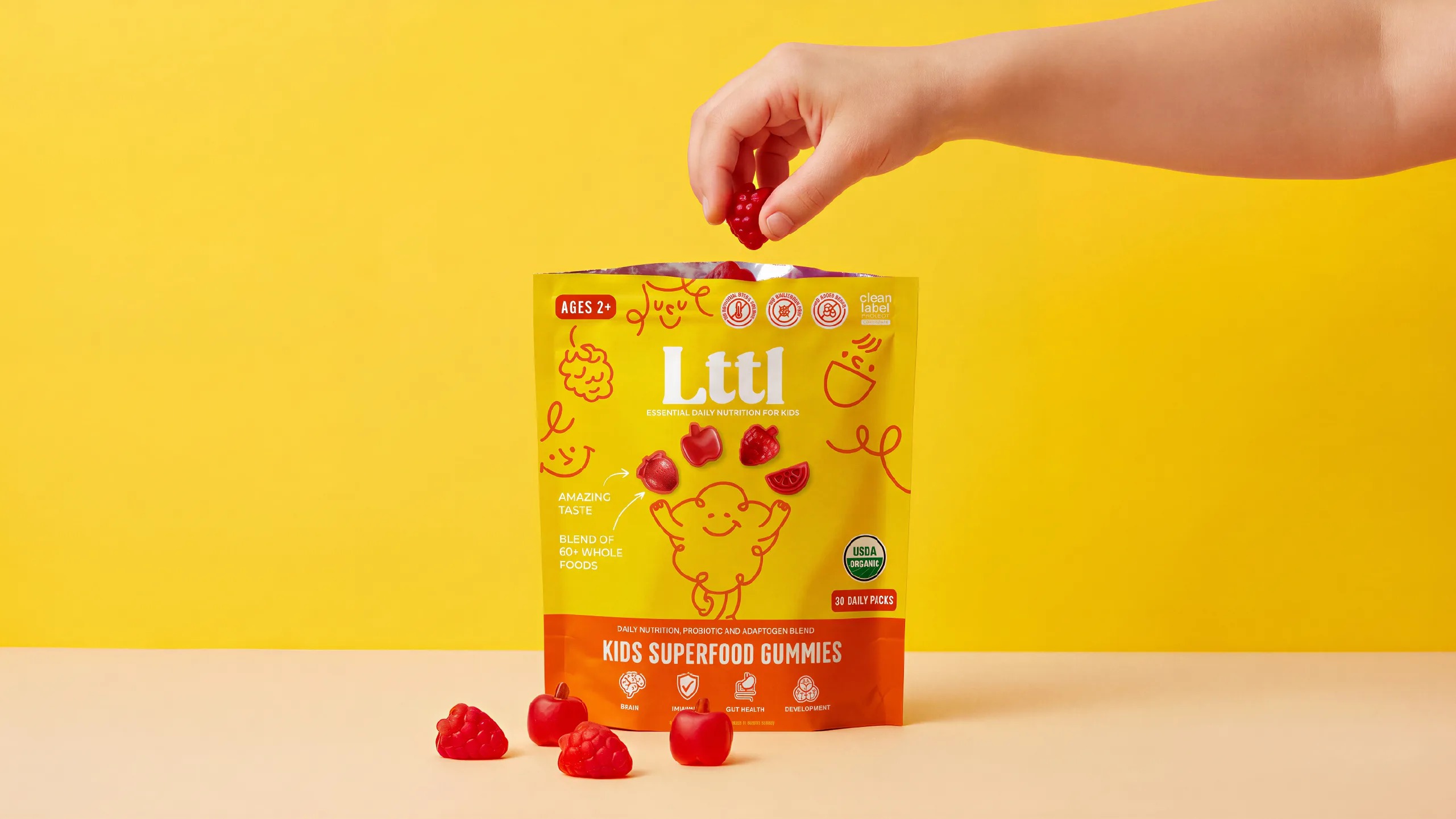
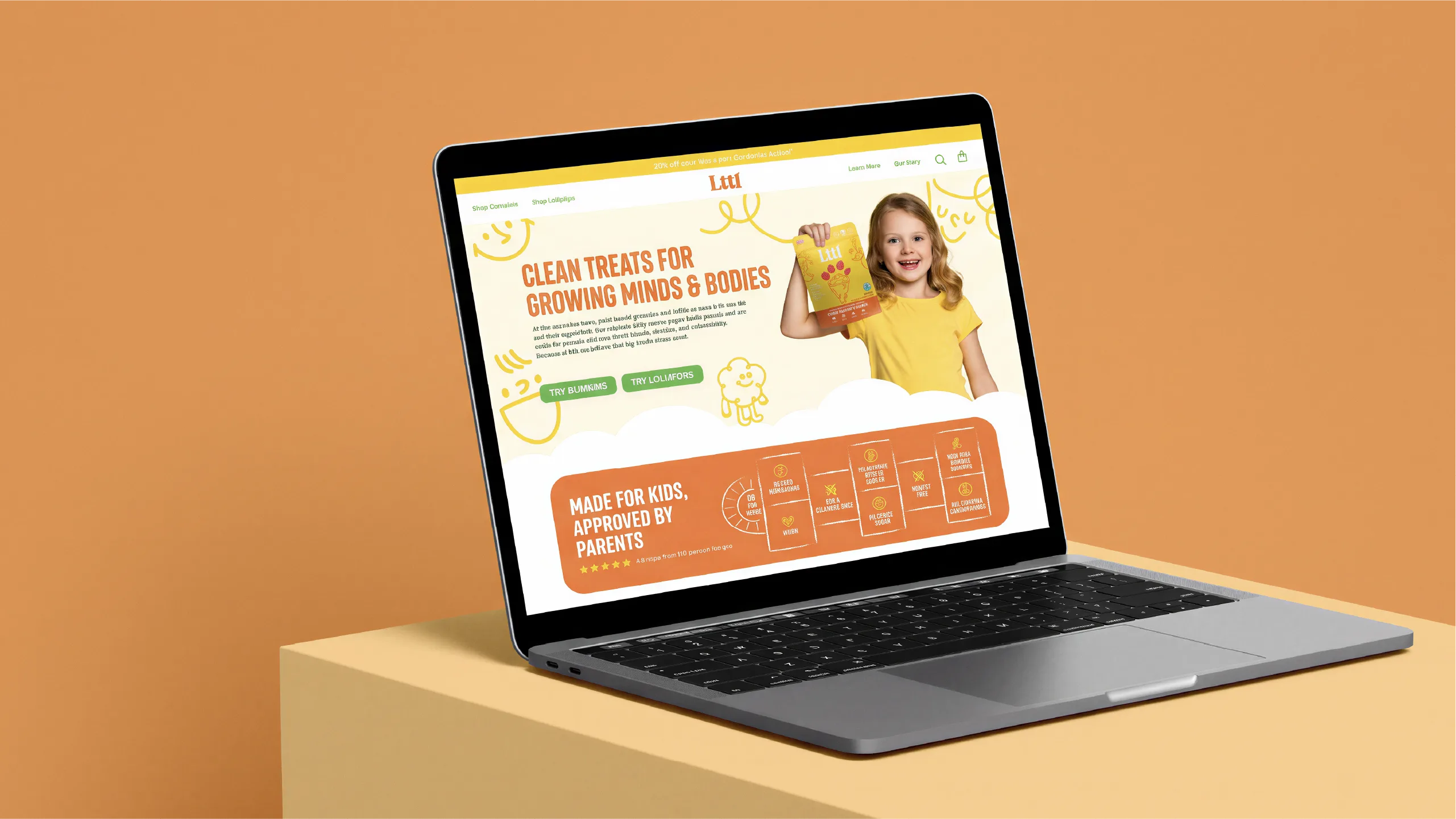
Kids' vitamins usually look like medicine, and the parents buying them want something they can trust. Lttl is organic, clean-label nutrition for kids, from superfood gummies to throat-soothing lollipops, with a friendly cloud character and bold, appetizing color. We took it from brand pillars and moodboards to packaging, merch, social and an online store that leads with the fun and backs it up with the ingredients and a Learn page.






Gallery
More shots in the oven.
We're shooting this one now. Check back soon, or see what's already out of the oven.
See all workThe full story
The challenge
A new kids' supplement brand walks into a shelf of cartoon mascots and medicine-cabinet white. Lttl had to feel playful enough for the kids eating it and trustworthy enough for the parents buying it: holistic moms looking for a natural alternative to big pharma, and working parents looking for a quick, affordable way to support their kids' health.
What we did
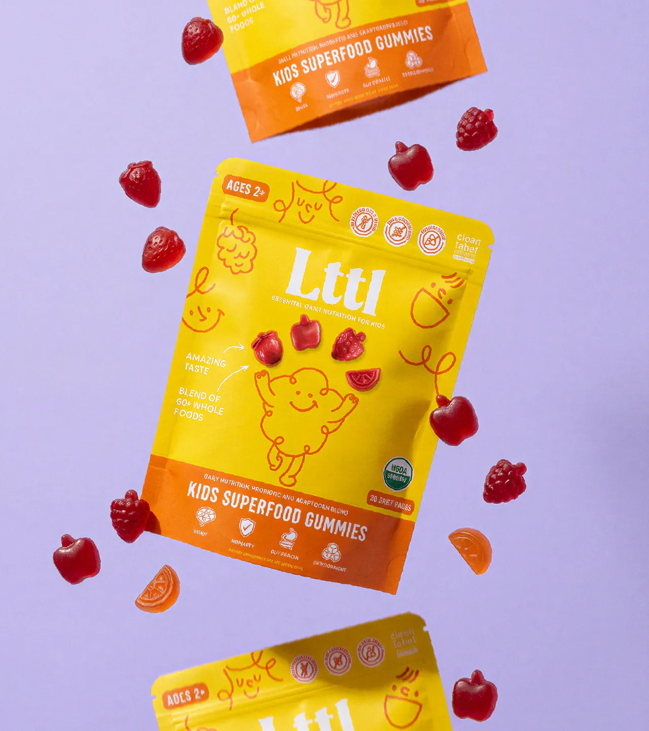
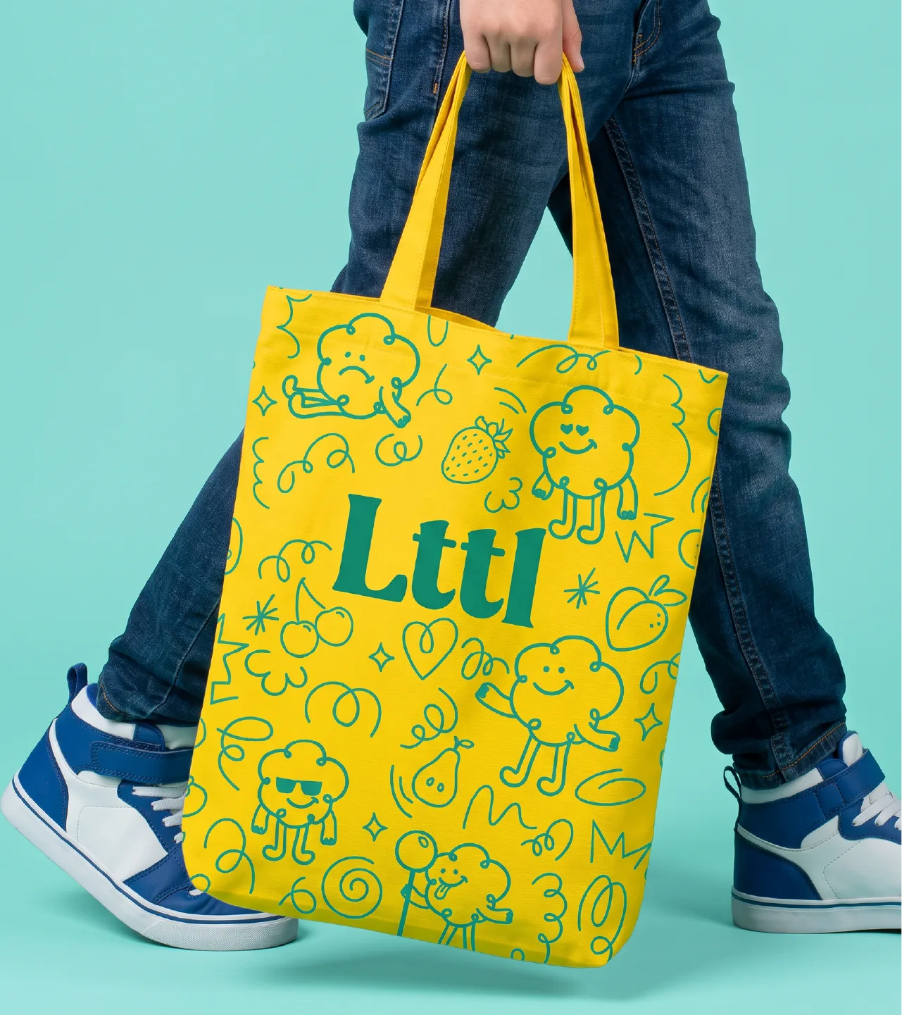
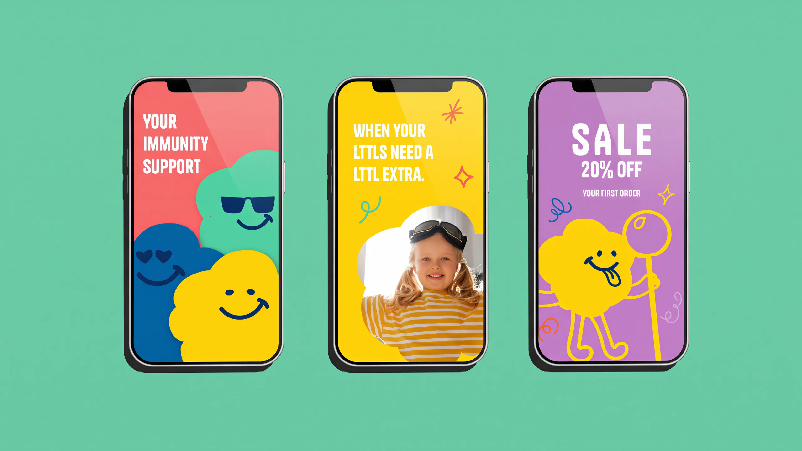
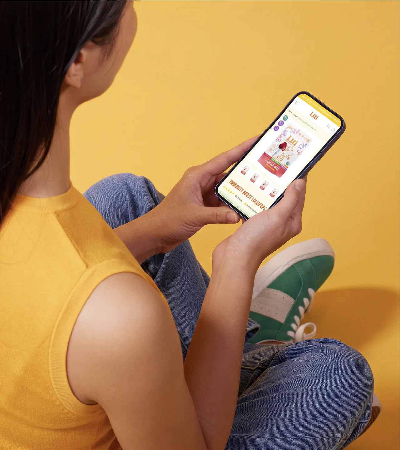
We started with research: competitor sites, structure references from the client's other brands and three moodboard directions, one quirky, one clean and appetizing, one calm and trusted. The direction we landed on was bright, bold minimalism: health conscious, appetizing and full of personality, built on pillars of quality, honesty, disruption, education and a better tomorrow. From there we designed the logo and cloud character, the packaging for the two launch products, Kids Superfood Gummies and the Kids Lollipops Variety Pack, plus merch, social and the online store.
The result
Lttl now has a full brand system and two launch products ready for the shelf: Kids Superfood Gummies and the Kids Lollipops Variety Pack, each with its own packaging. The cloud character, color and voice carry through merch, social and the online store, so every new flavor and product that follows can slot into the same family.
Similar projects

Magic Dose
