

HiFi
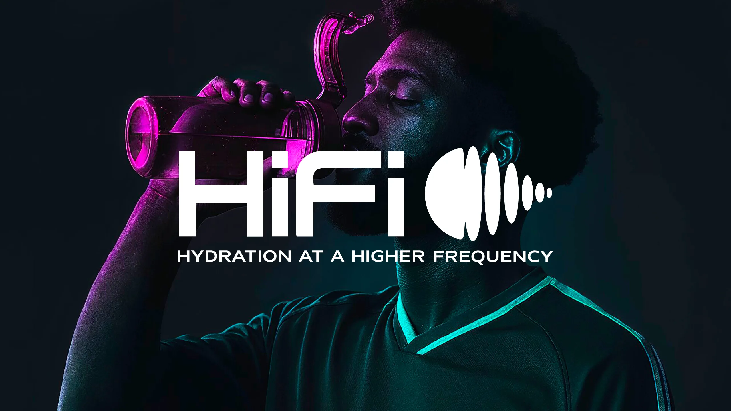
Sports drinks are sugary. Supplements are clinical. HiFi wanted hydration to feel like equipment. We built the brand identity and packaging design around one daily ritual: one stick, water, shake, go. A dark, premium look with a little retro-cool makes it something worth carrying, not just drinking.


Gallery
More shots in the oven.
We're shooting this one now. Check back soon, or see what's already out of the oven.
See all workThe full story
The challenge
Sports drinks are sugary. Supplements are clinical. HiFi wanted hydration to feel like equipment: a premium daily electrolyte stick for people who train, travel, create and work long days.
The brand needed an identity and packaging that said that at a glance, in a category crowded with bright colors and wellness clichés.
What we did
We built the brand identity and the packaging design around one daily ritual: one stick, water, shake, go. A dark, premium look with a little retro-cool sets HiFi apart from the candy-bright shelf, and a color for each flavor keeps every stick easy to tell apart.
Then we applied the same system to the stick packs and the variety packs, so the whole line reads as one piece of gear. See more of our brand identity and packaging design services.
The result
HiFi now has one look that runs from the logo to the stick pack to the variety pack, built to hold every flavor that joins the lineup. It reads as something you carry, not just something you drink.
Building a beverage brand of your own? Start a project with RSNL Creative, or see how we handled First Gen.