
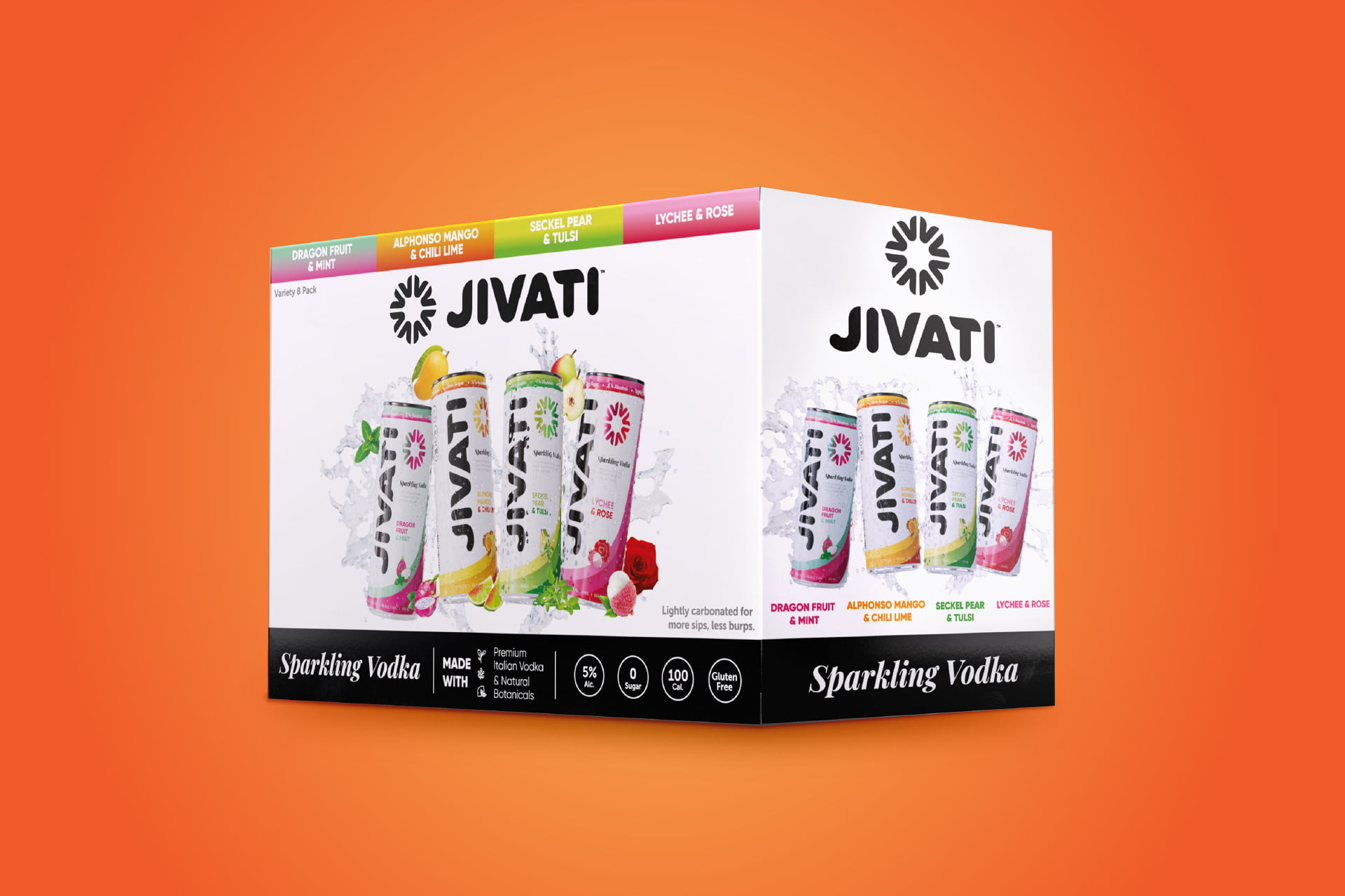
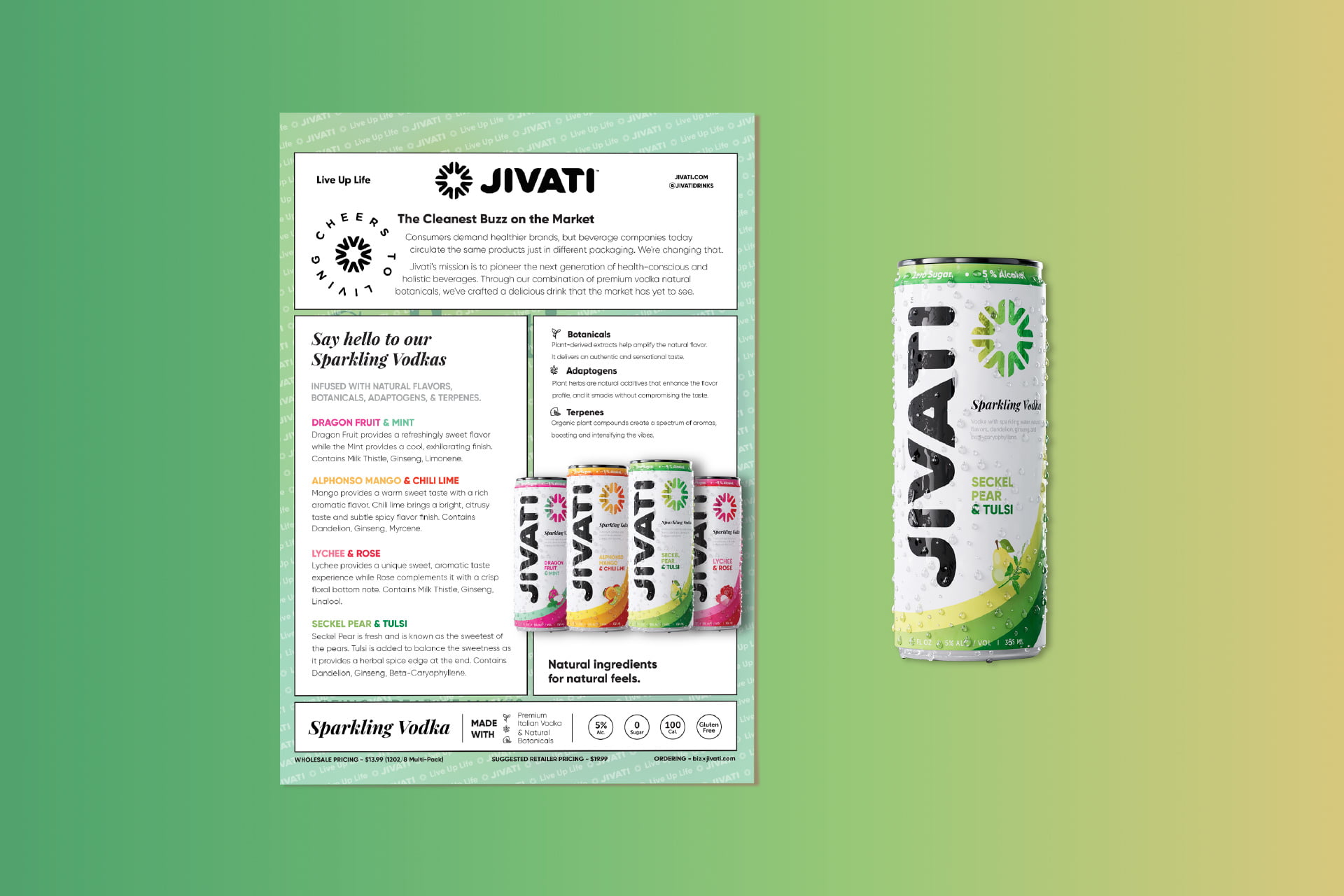
The hurdles for Jivati were as diverse as their flavors. The muted color palette risked the brand blending into the background. Flavor information playing second fiddle to other details was a stumbling block and the confusion arising from similar flavor colors. Finally in this journey, community engagement and storytelling play a crucial role, transforming Jivati into more than just a beverage but a vibrant, community-driven experience.
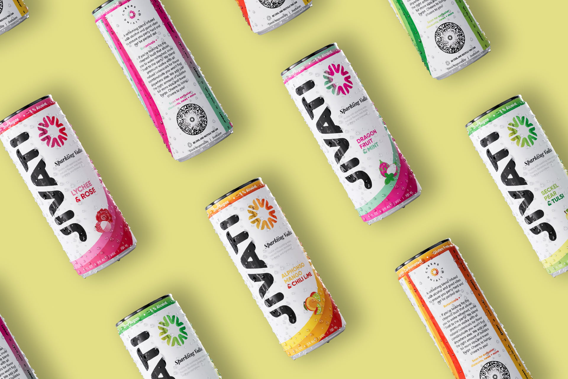
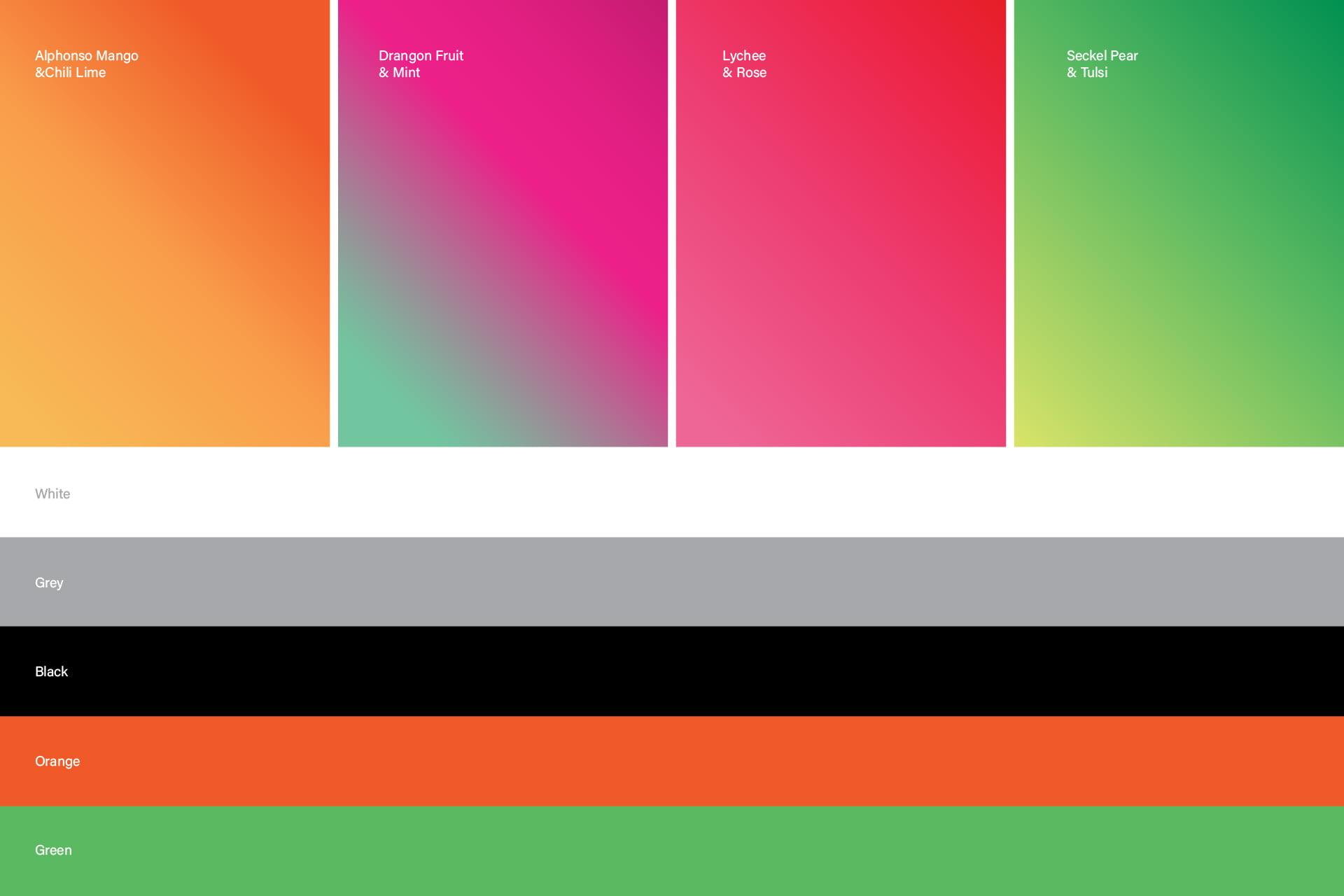
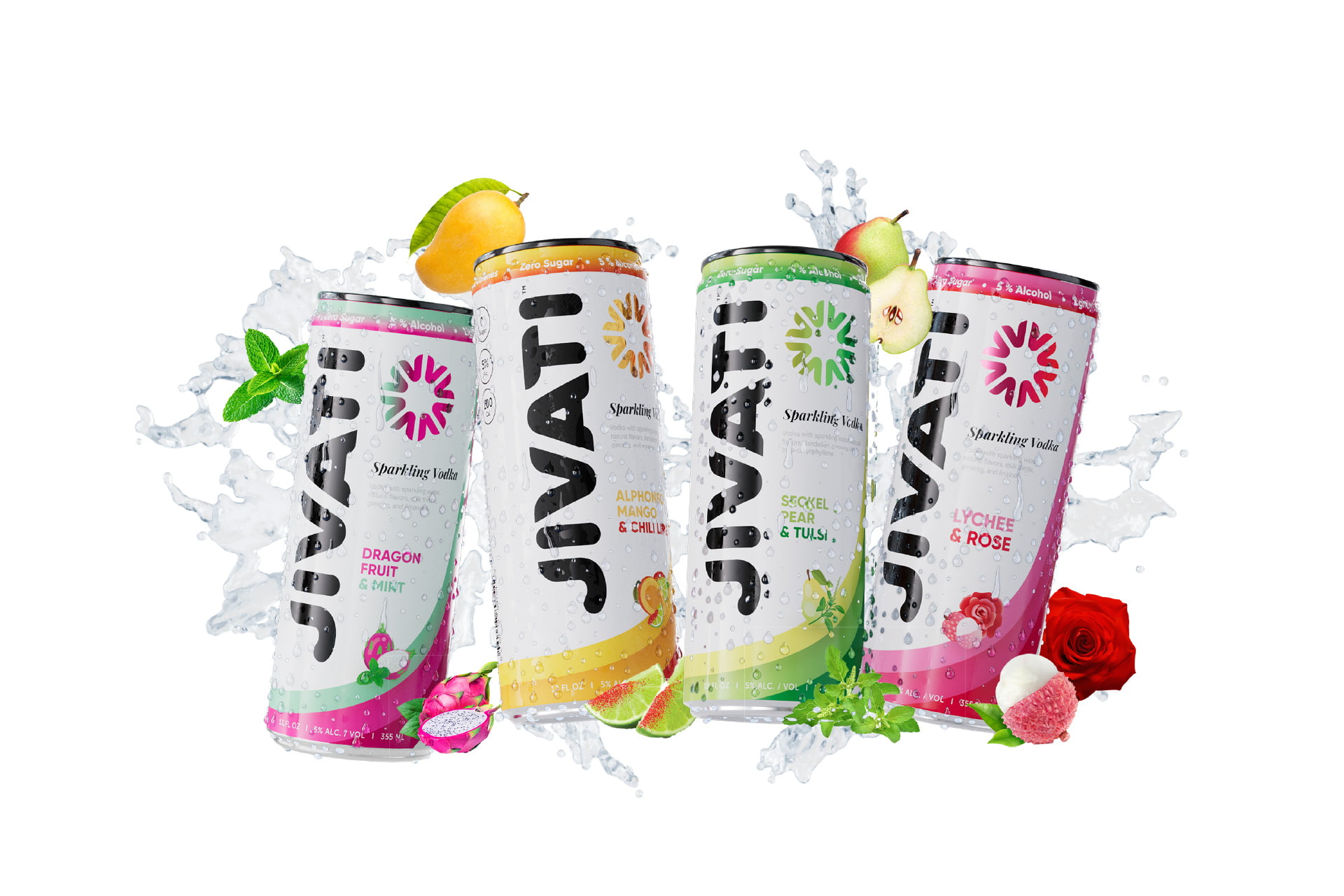
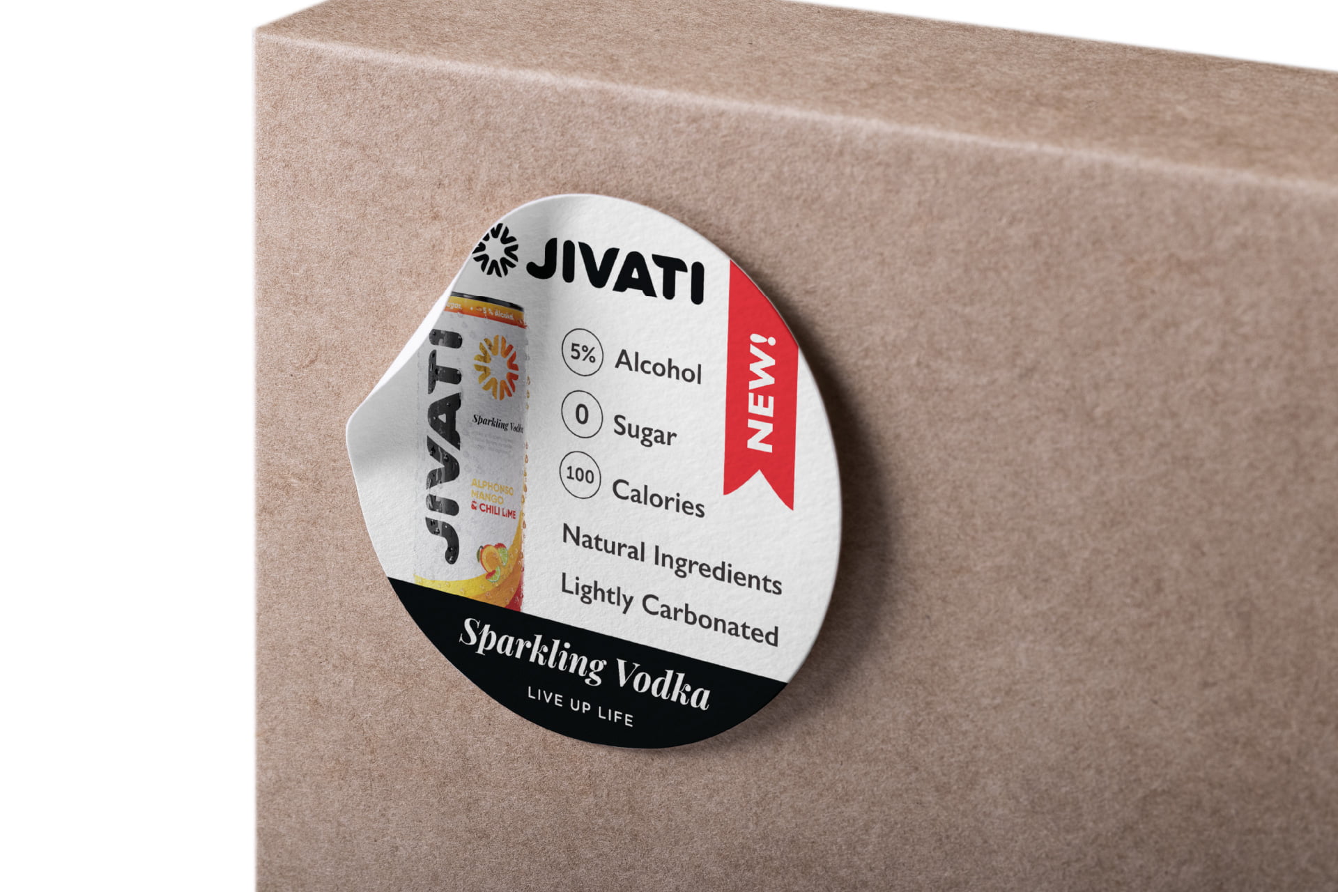
Jivati’s makeover involves injecting life into its brand through vibrant colors that not only distinguish it on shelves but also evoke positive emotions. Flavor information takes center stage with a clear hierarchy and clever iconography for quick recognition. To dodge consumer confusion, each flavor rocks its own distinctive color, fruit imagery, and top brand sell points ensuring brand messaging consistency and easier consumer conversions. The redesign isn’t just about aesthetics; it’s about community engagement, incorporating local preferences, and telling a captivating brand story. Jivati isn’t just a beverage; it’s a lively and interactive experience, from the packaging to seasonal variations and engaging QR code content.